2022
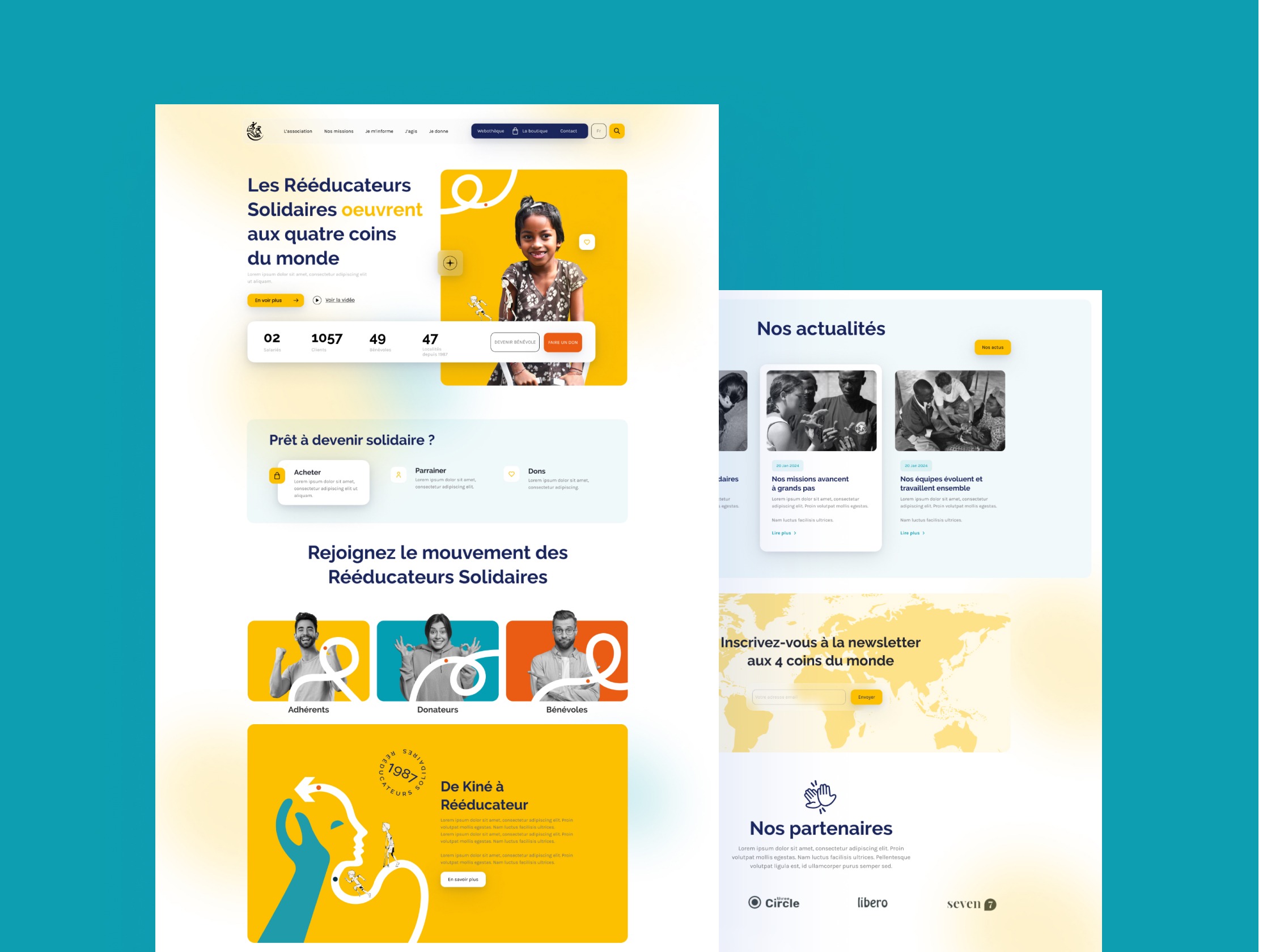
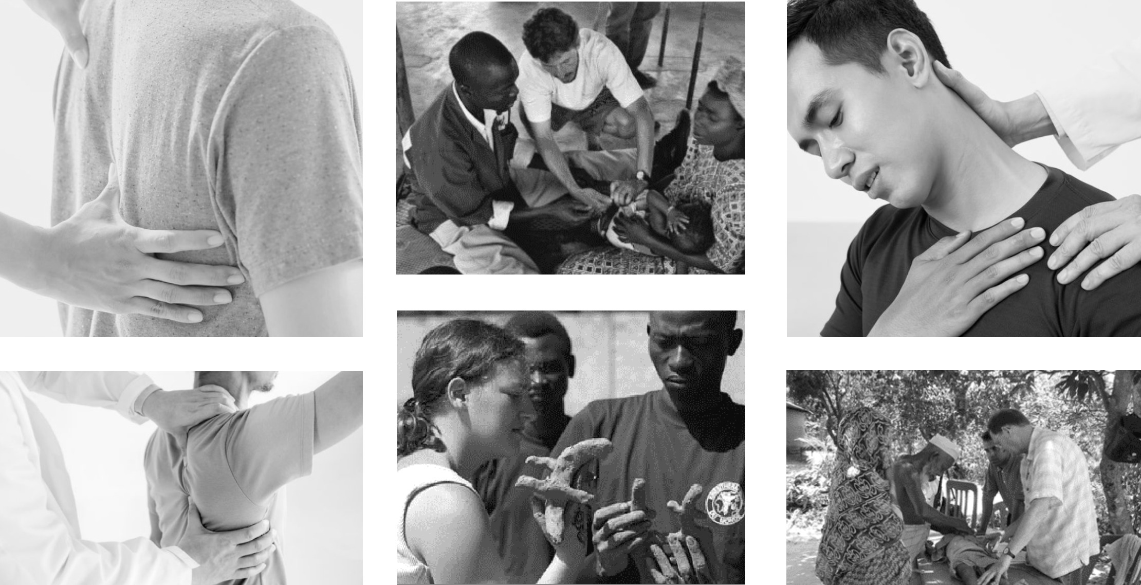
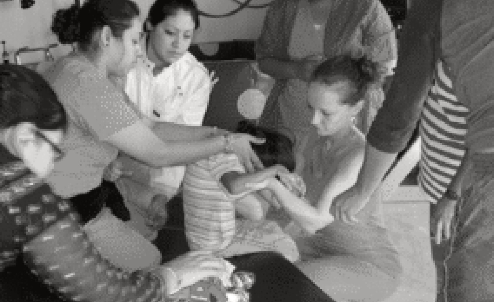
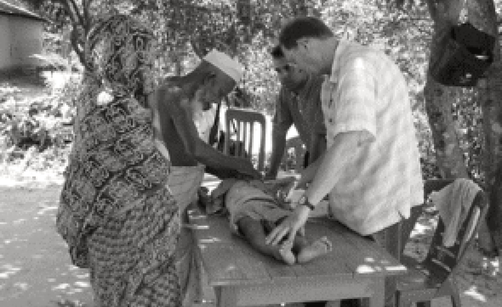
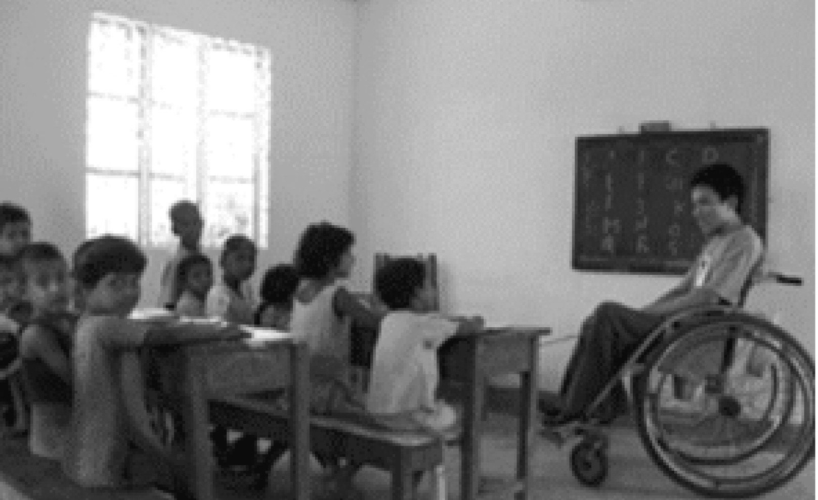
DemoFounded in 1987, the association works with the most vulnerable to meet the fundamental right of access to rehabilitation care for everyone, everywhere in the world, including France.
In the rehabilitation professions, we find the following qualities: empathy, listening to the patient and teamwork.
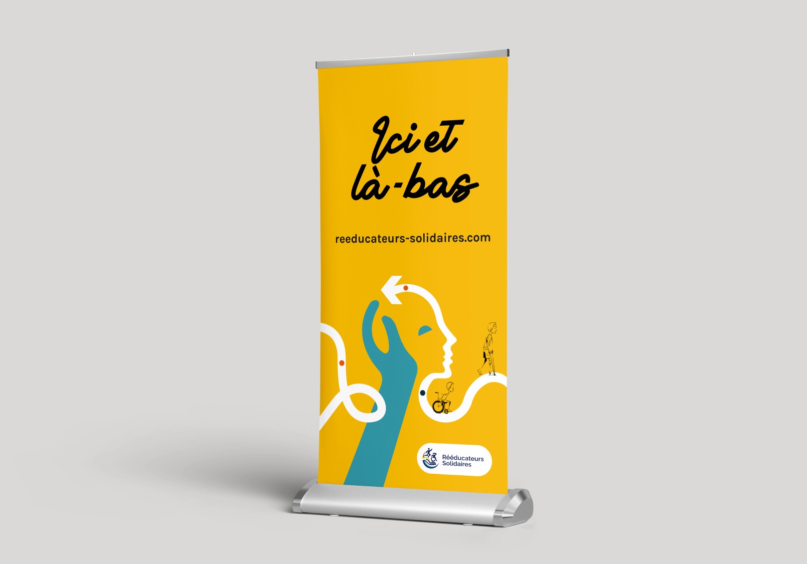
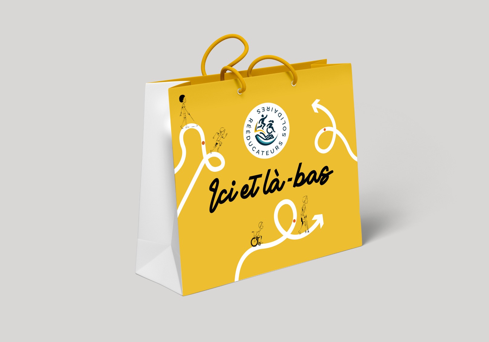
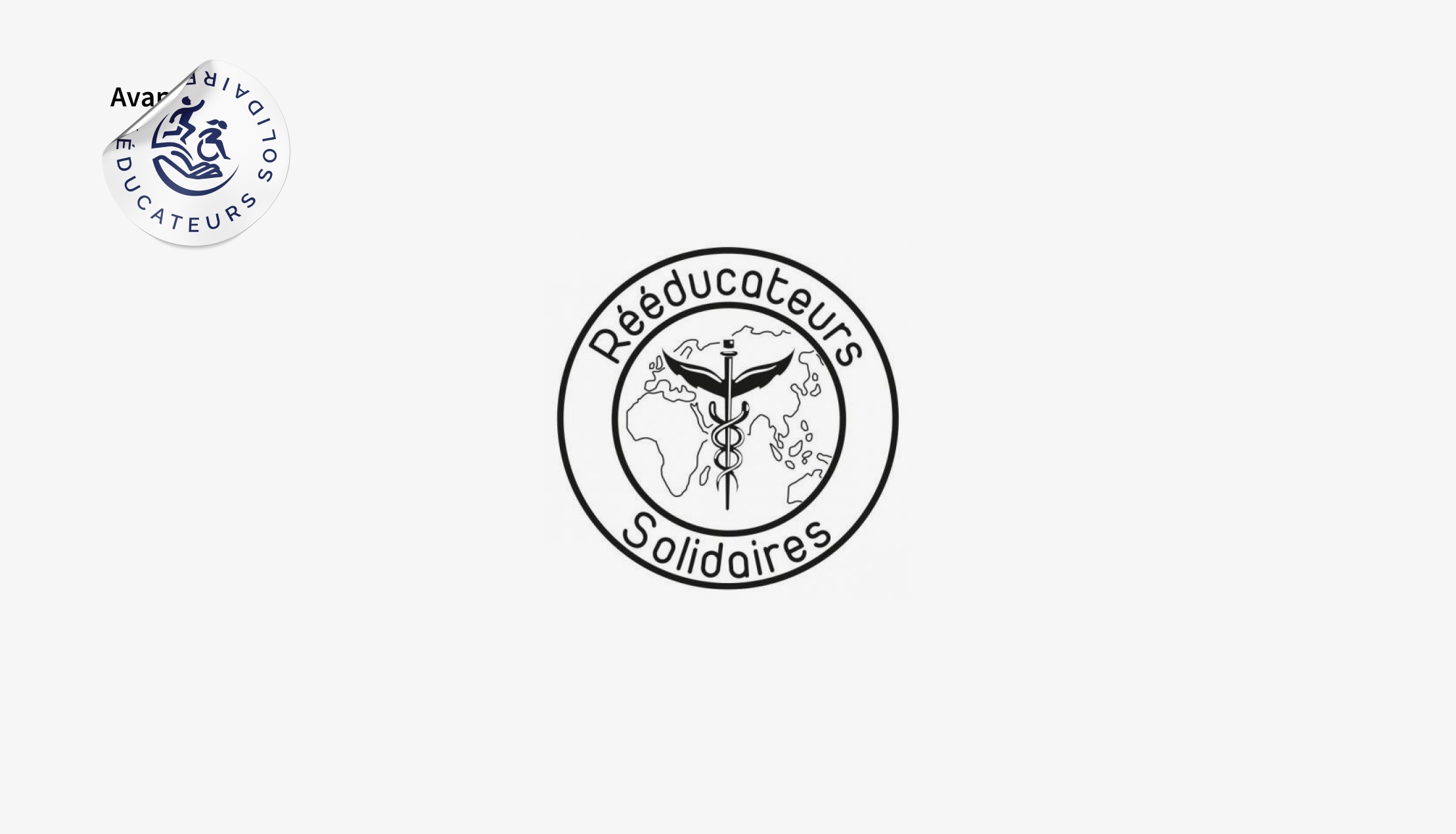
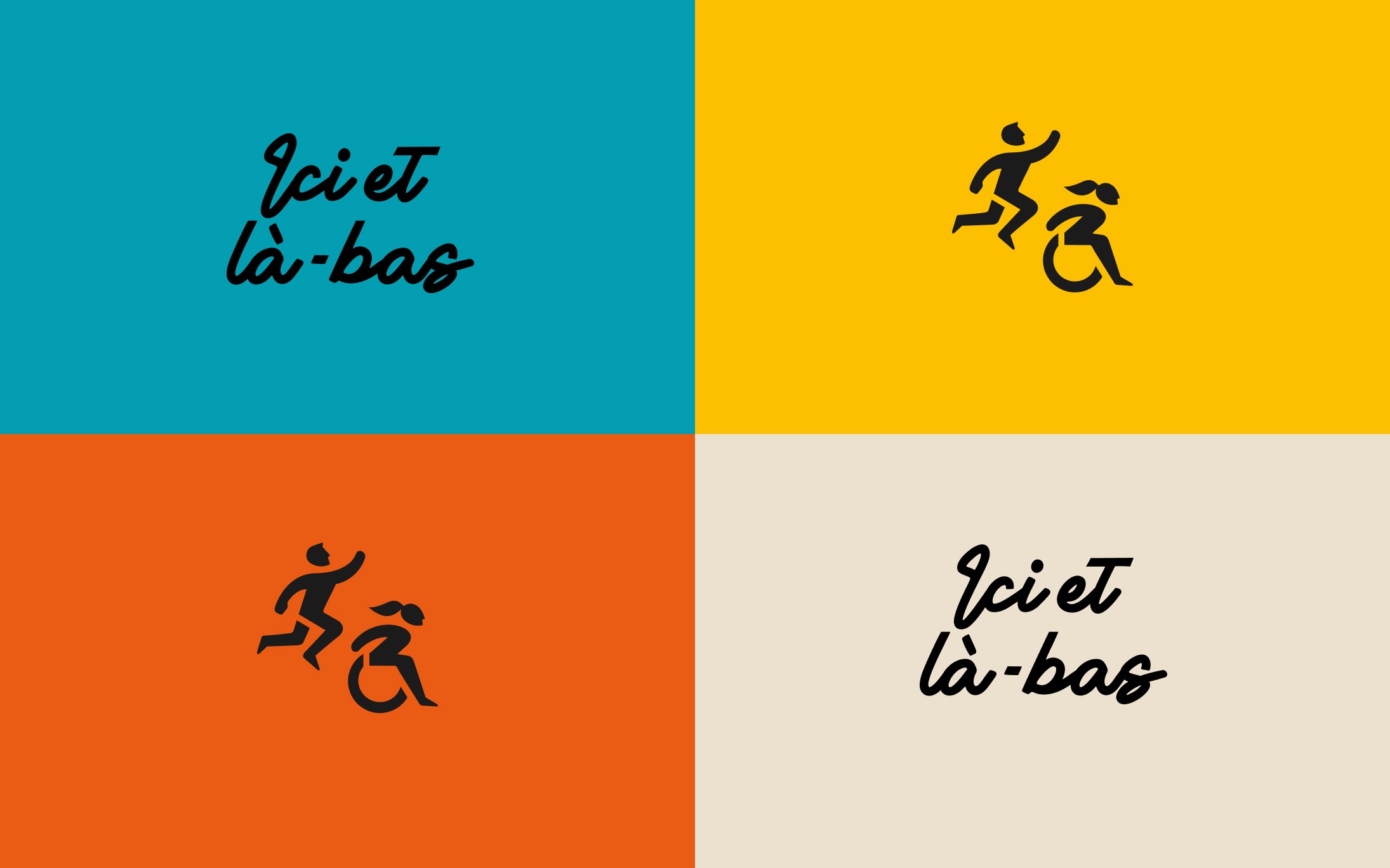
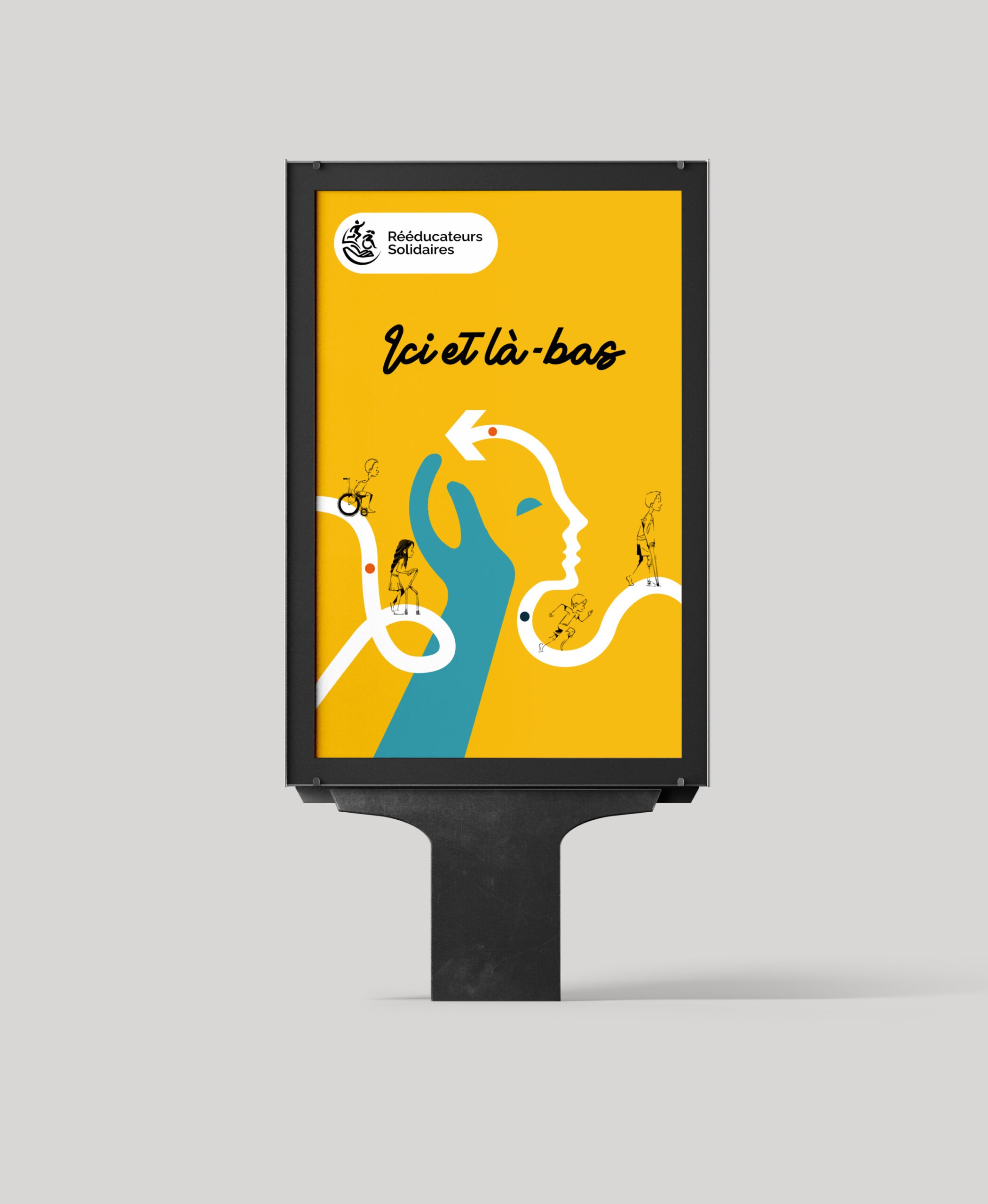
The new name "Rééducateurs Solidaires" emphasizes solidarity and joint support through its "here and there" wording and signature. The new name is also an affirmation of the importance of inclusiveness within Rééducateurs Solidaires, whose previous name did not represent all of its members.
Concept
Make the voice of Rééducateurs Solidaires resonate through a new name and a new brand image.
The new identity represents the mission of facilitating access to rehabilitation care for the most vulnerable people in the four corners of the world, including France, and of being the spokesperson for this mission, under a new name and emblem.
The new identity materializes this mission in the form of an emblem that is at the convergence of action and support.
Directional axes
- Development
- Intervention
- Training
- Support
- Solicitation
- Rehabilitation
- Solidarity
- Humanity
- Volunteers
- Volunteer work
- Movement
- Commitment
- Improvement
Development
Sharing knowledge and know-how in a long-term perspective. perspective.
Rehabilitation
Refers to the action of mobilizing members to restore their flexibility and strength.
Volunteers
No-obligation assistance and intervention on request.
Movement
The action movement, the movement to care for the most vulnerable.
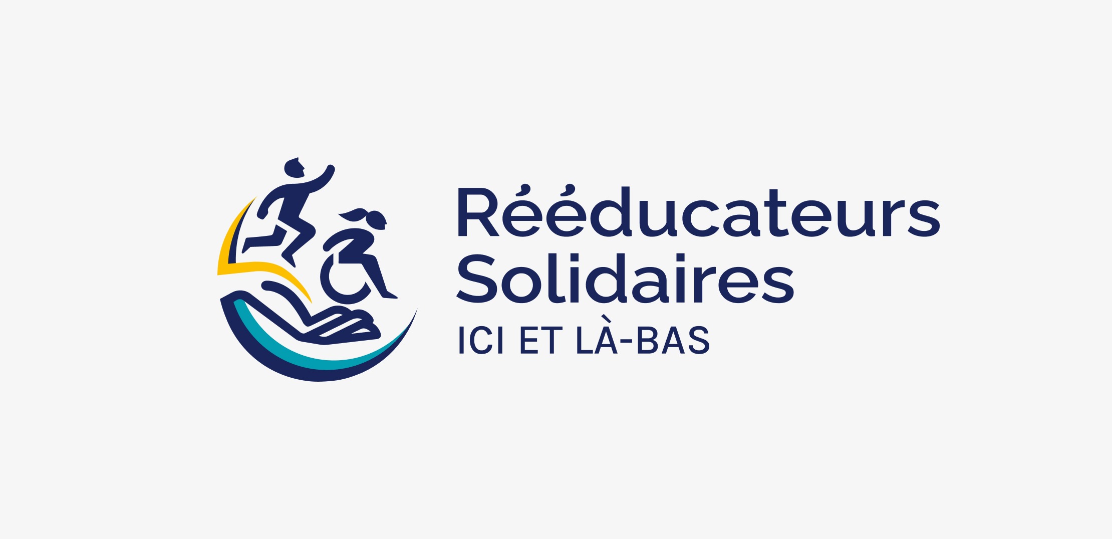
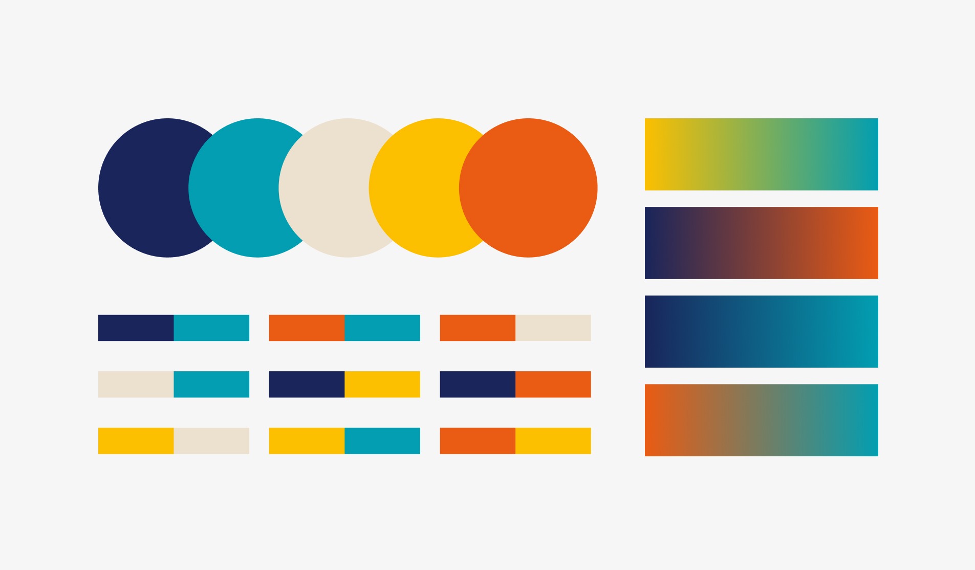
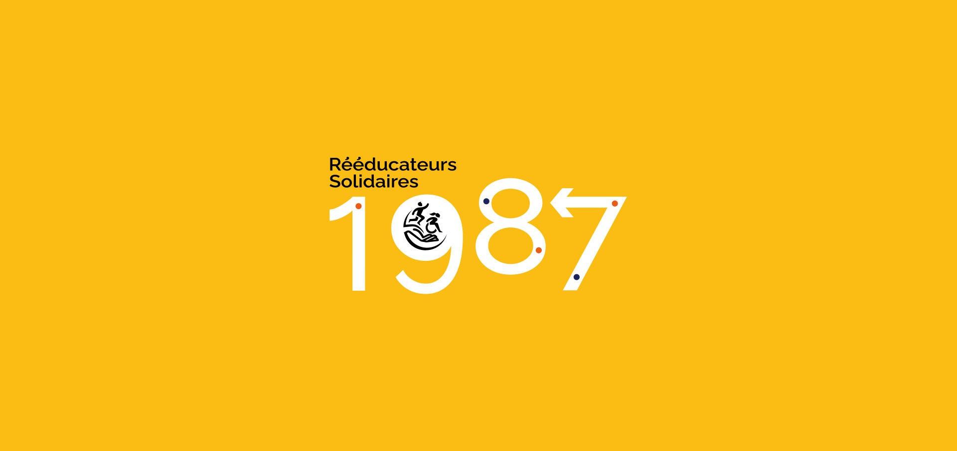
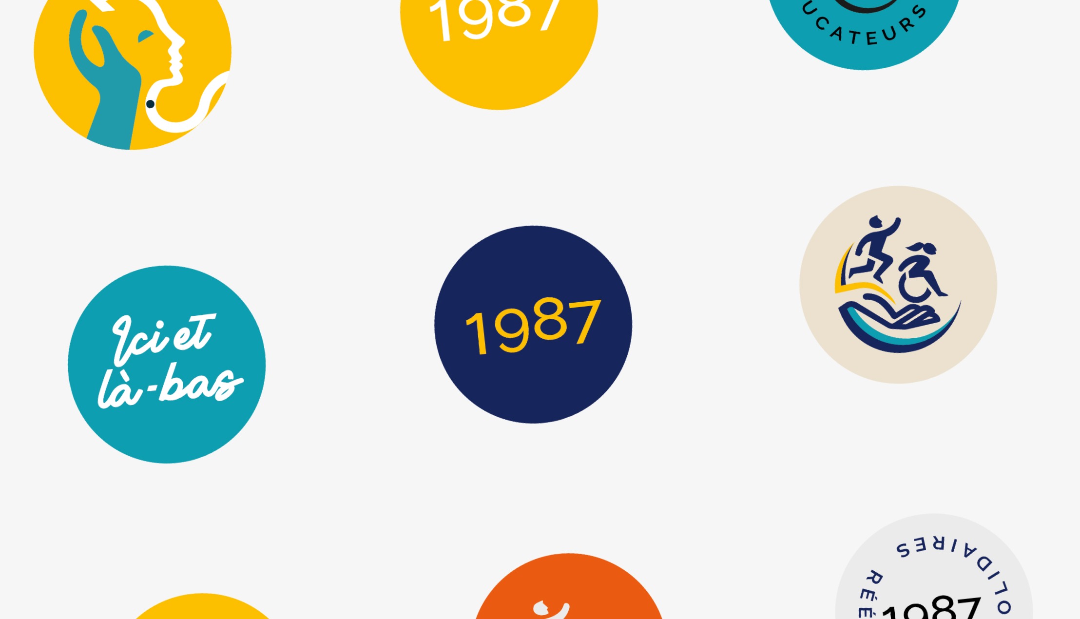
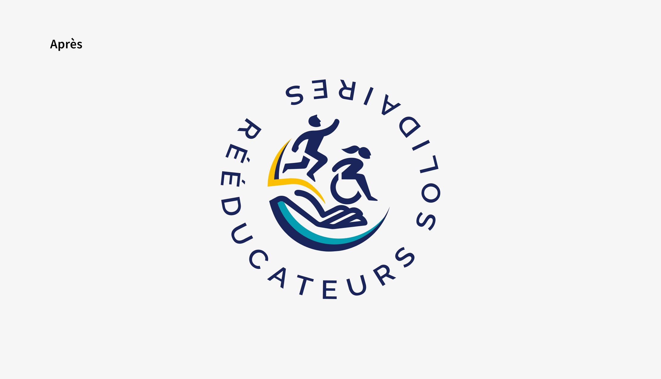
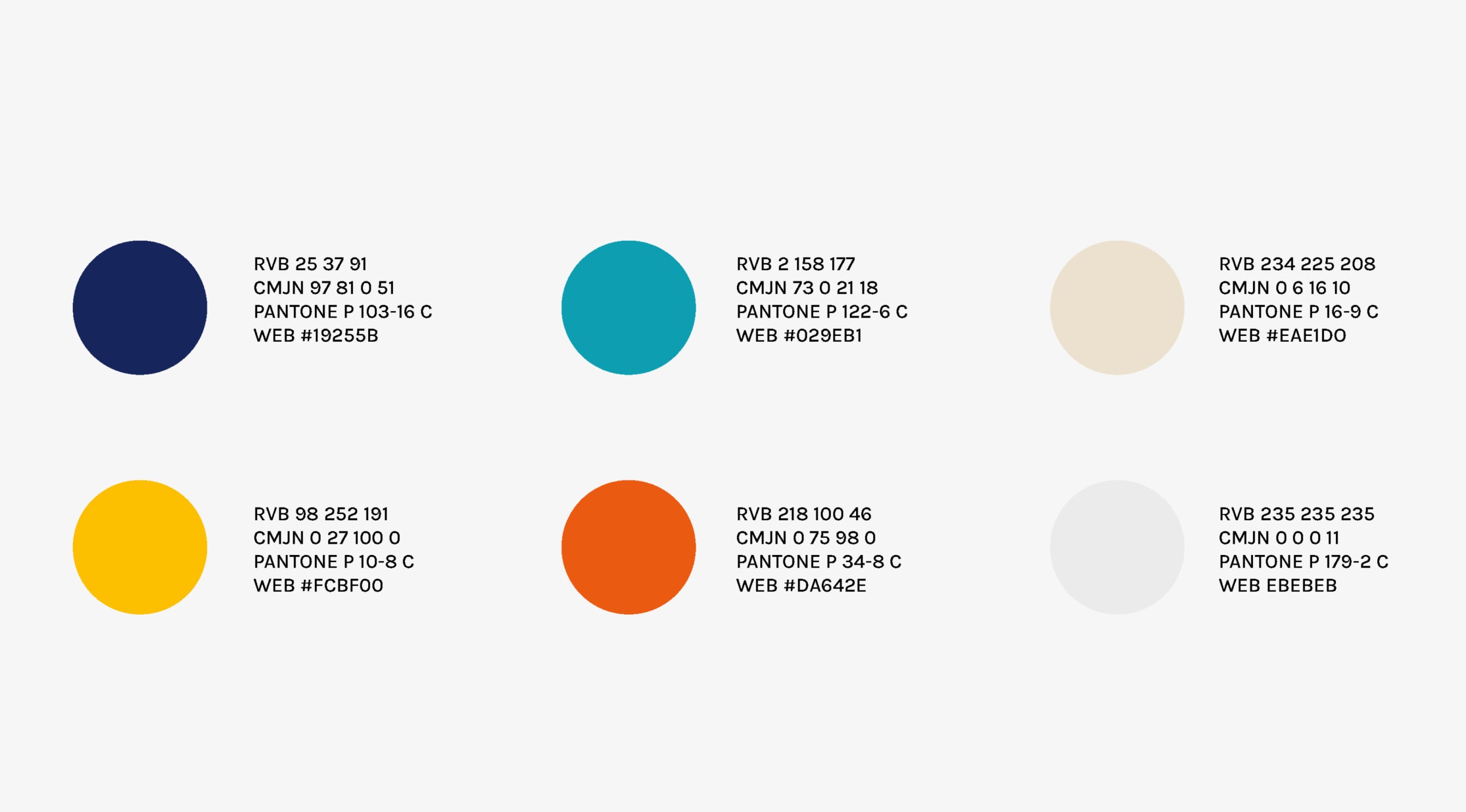
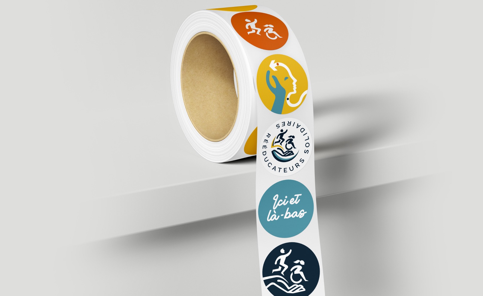
The new logo has a simple, high-impact design. This gives it a strong visual presence among its partners. The new color represents a transition to a more open brand spirit, while allowing it to stand out among other identities.
The emblem is the central element of the new identity. It represents the association's support and guidance. It also symbolizes the role played by Rééducateurs Solidaires as a spokesperson for the association's work with the most vulnerable, in response to the fundamental right of access to rehabilitation care for all. Its colors embody a dynamic, forward-looking action. An impactful, inclusive and open logo.
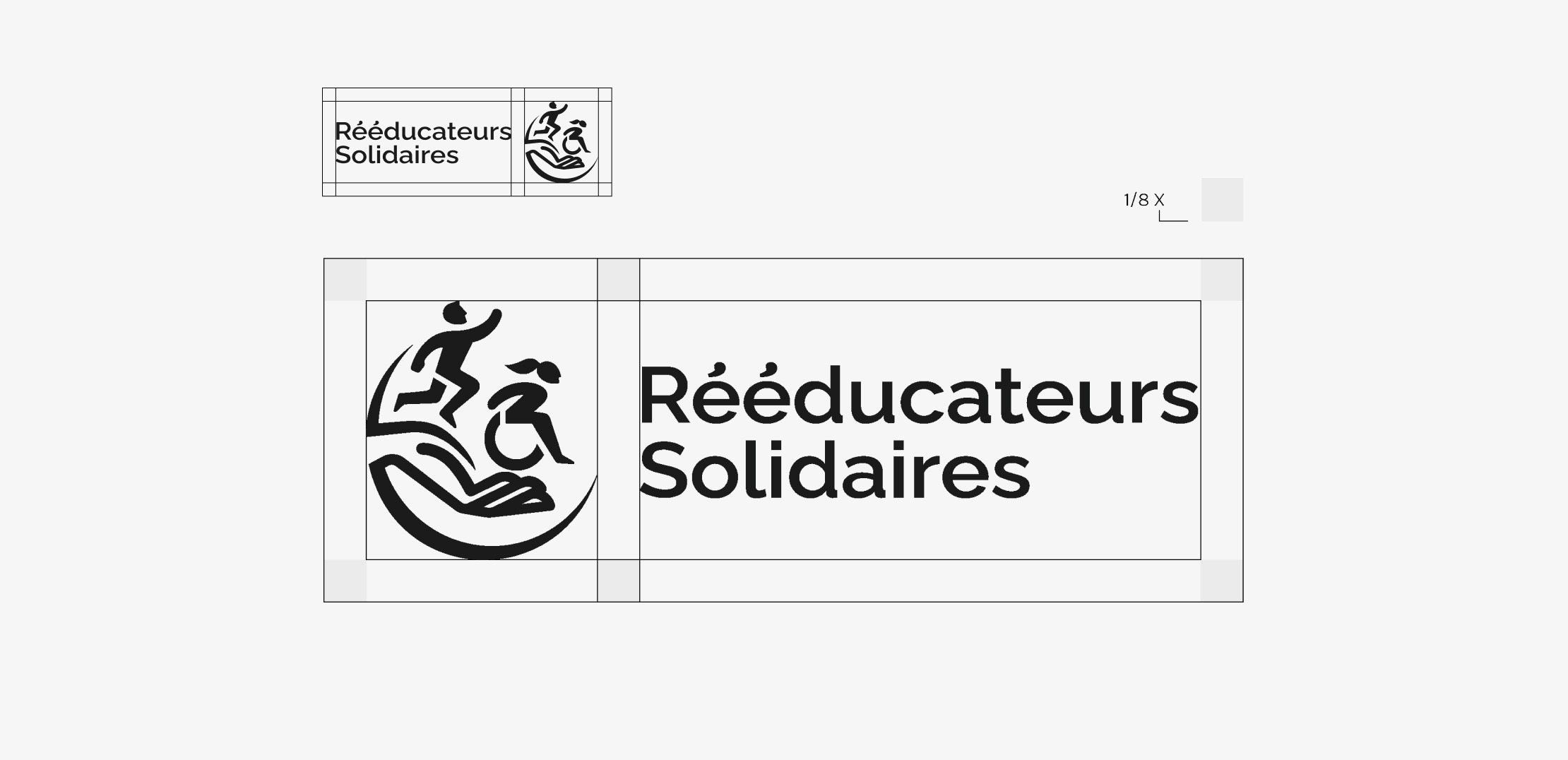
Choosing one font for your brand name and another for your signature remains the best solution. Fonts can make all the difference in logo design. That's why it's important to choose a font that accurately represents your company's values and maximizes the impact of your design.
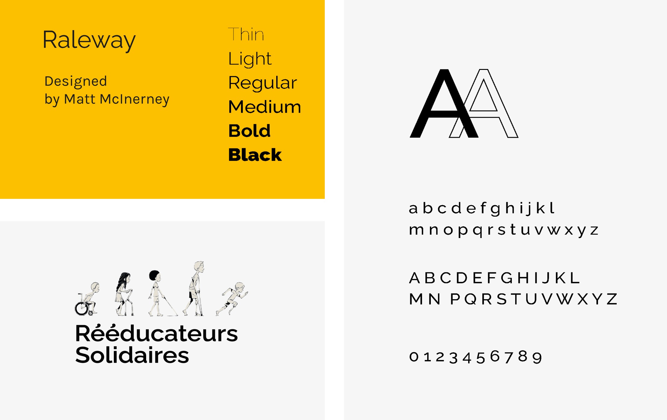
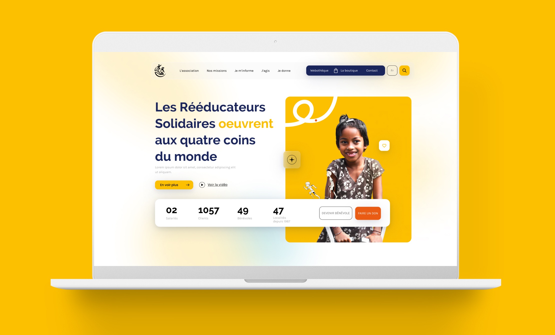
Visual identity is the set of visual elements that represent an organization in a unified, recognizable way.
It's the brand's face to the world and its most important marketing tool. A strong visual identity can also be a company's greatest asset, enabling it to build strong relationships with customers and partners, generate greater trust and loyalty, and position itself more favorably in the marketplace.